Heritage Walk

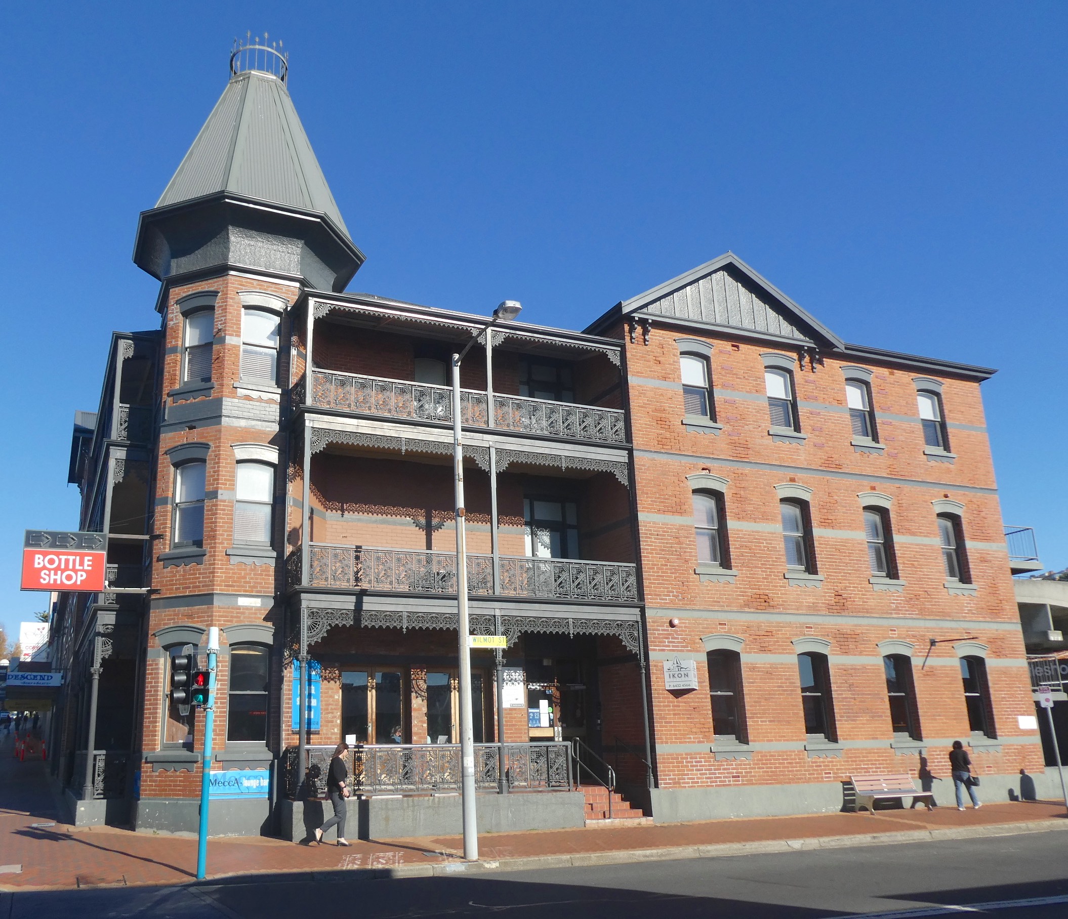
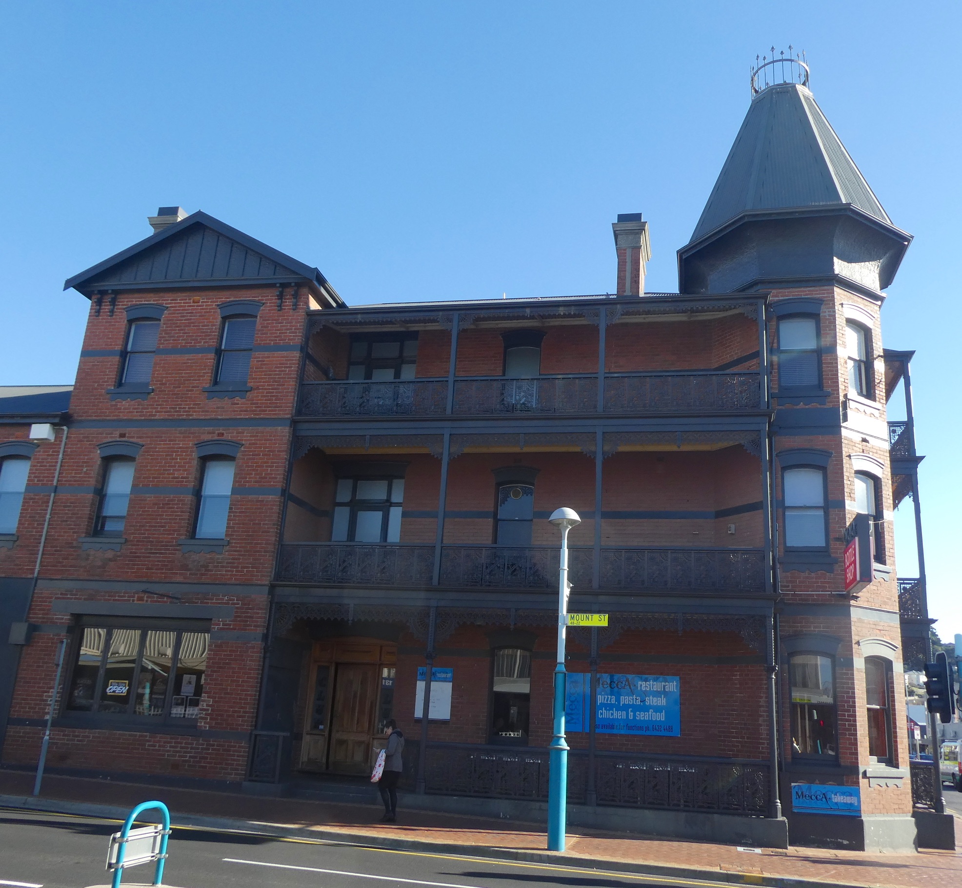
After discovering the beautiful Federation Homes of Burnie and delving further into the history of the town, I set out to investigate the civic buildings from this period. These are by no means the only significant heritage buildings in Burnie, they are merely the example promoted by the ‘Federation Walks of Burnie’ pamphlet. The prominent Ikon Hotel was established as the Club Hotel in 1912 by J.T. Alexander. The Alexander family pioneered European settlement at Table Cape and with support from his family, J.T. built his own hotel after leasing the Sea View (now the Beach Hotel) from 1902 to 1910.

Known for his generosity to many needy families during the Great Depression, Alexander faced mounting debts and was forced to sell the hotel in 1933. The three storey building, dominated by the tall pyramidal tower, is an example of Federation Free Style architecture with very fine cast iron valances and balustrades.

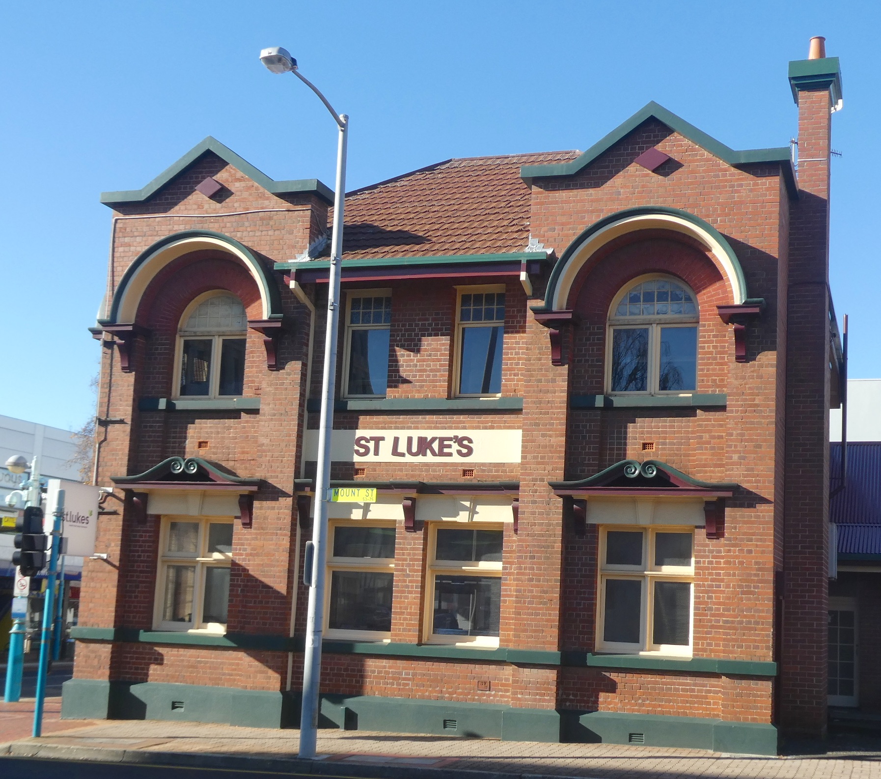
Built by the Hobart Bank in 1921, the St. Luke’s building is on the site originally used by the Don Trading Company as their wood yard. ‘Burnie Brick’ was used in the construction of many buildings of this era, dug and fired in the Cooee brickworks until 1967 when the clay was eventually exhausted and the business closed. Federation Free Style often incorporated features from other styles such as the Romanesque semi-circular arches and Art Nouveau pediments above the downstairs windows seen on St. Luke’s.

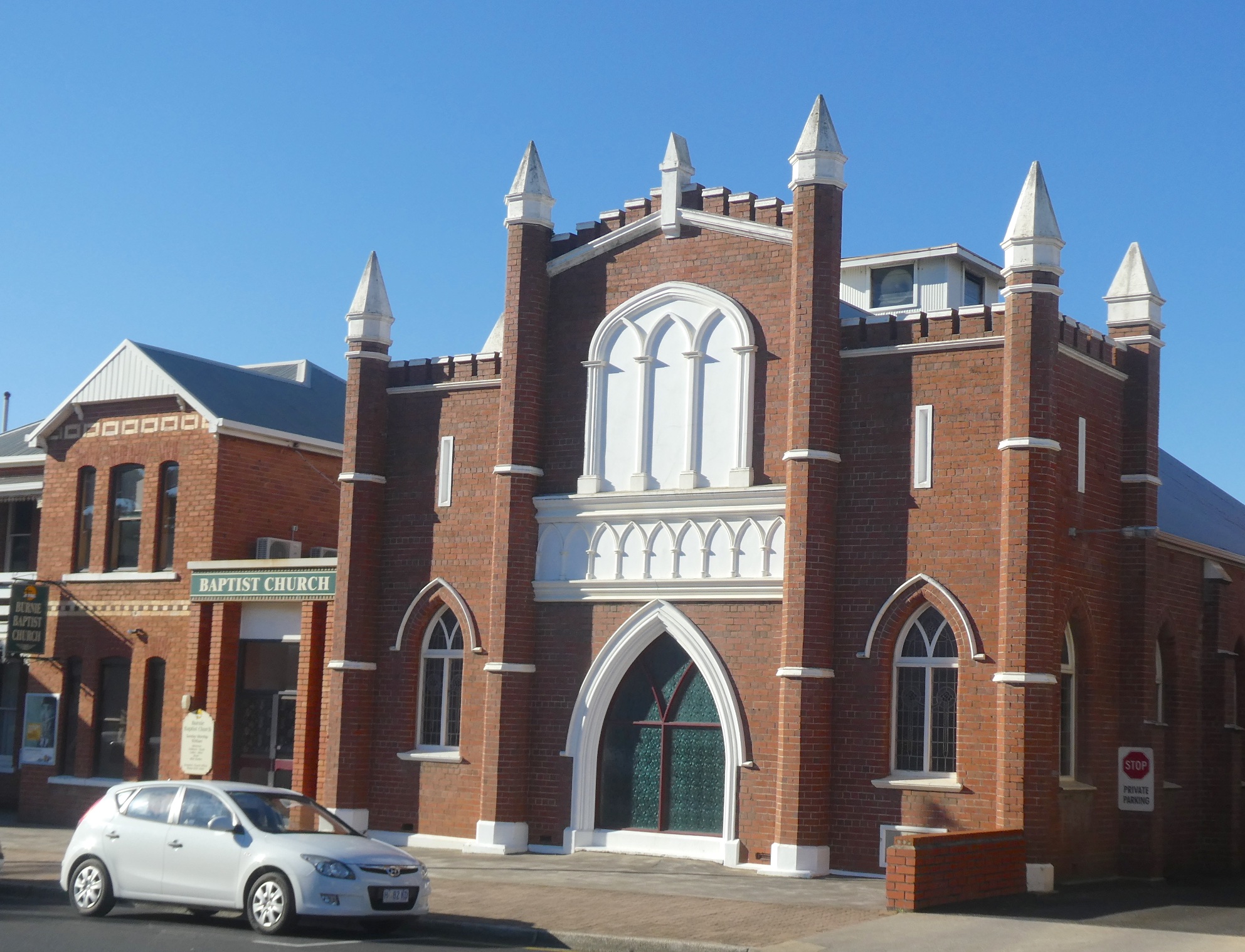
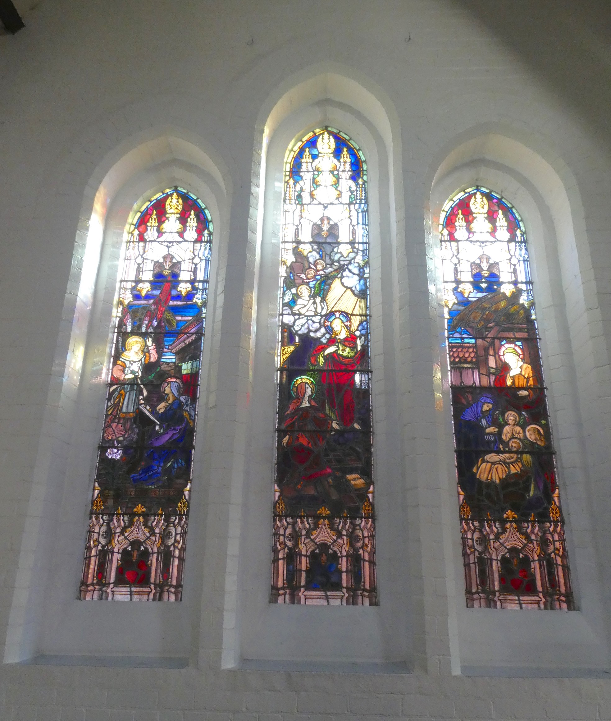
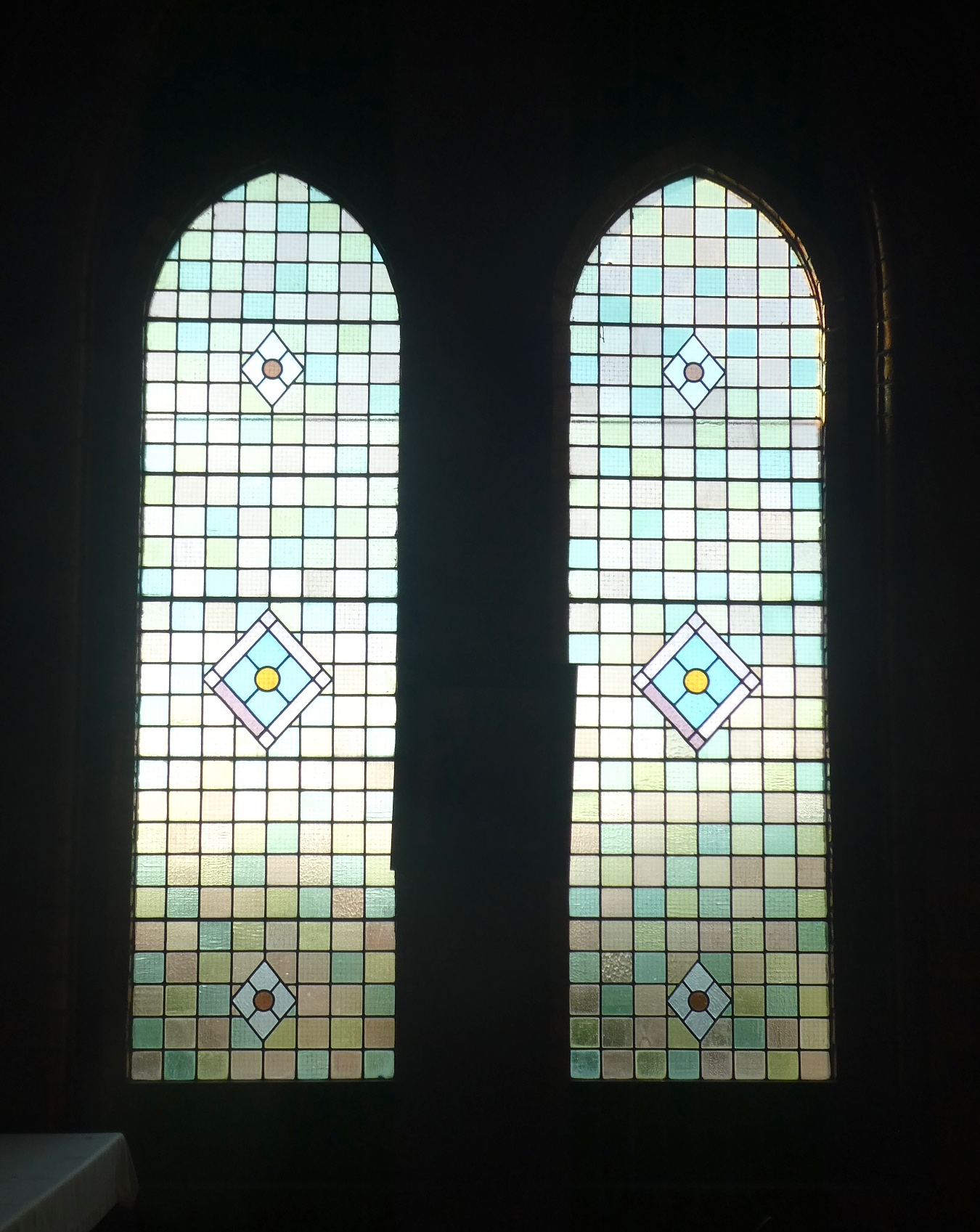
In 1899, a Baptist Church was established in the town with services held in the Town Hall. Funds were raised to purchase land and erect a purpose built weatherboard church and adjoining two-storey brick manse. By 1925, the church proved too small and the new brick version was completed almost entirely by voluntary labour of the parishioners. There are some medieval elements to the Federation Gothic style including pointed arch windows and doorways, blind turrets and arrow slits and a parapet resembling a battlement.

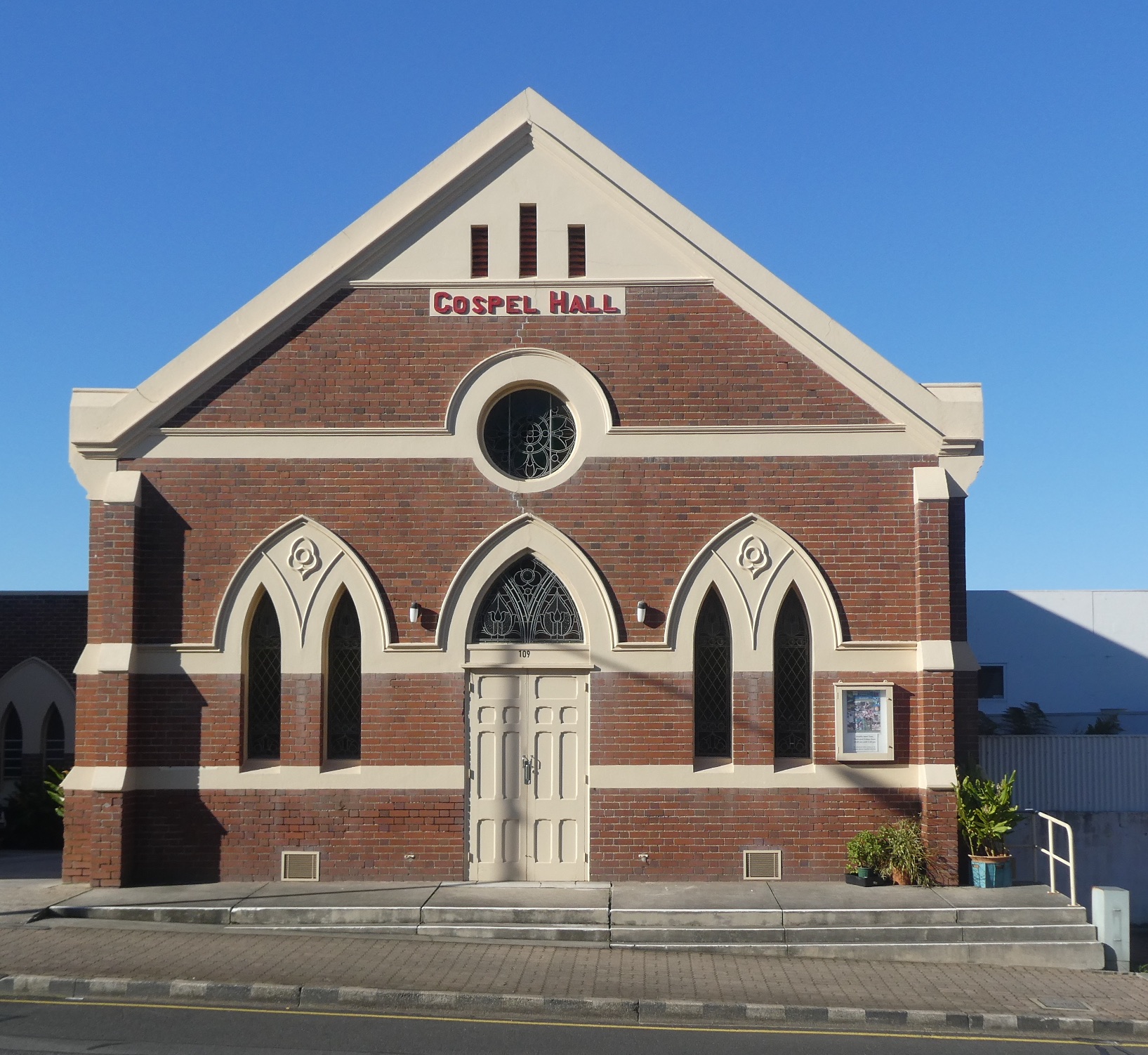
The Christian Brethren began services in Burnie in 1875 and a simple timber building was constructed a year later. The current Gospel Hall, built in 1915 and enlarged in 1930, is another example of Federation Gothic architecture with a steeply pitched roof, arched windows and the inclusion of Art Nouveau leadlight.

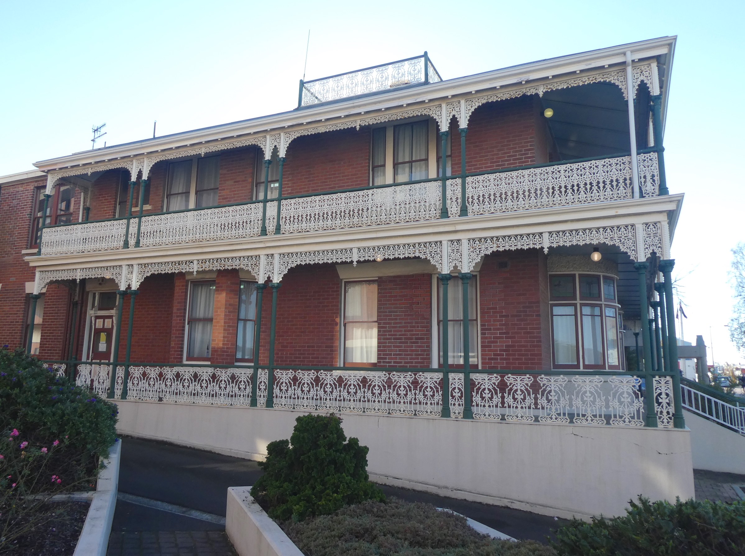
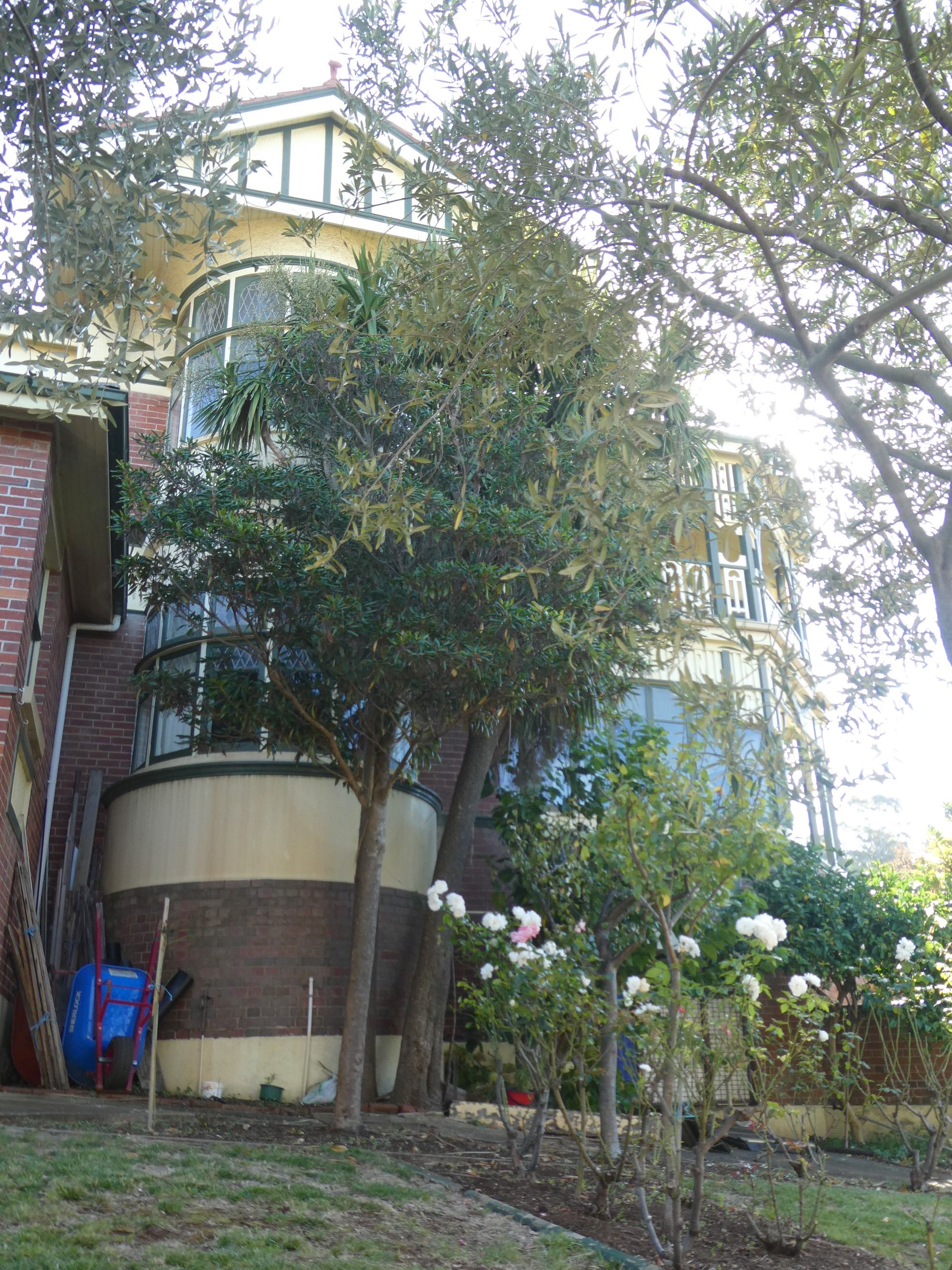
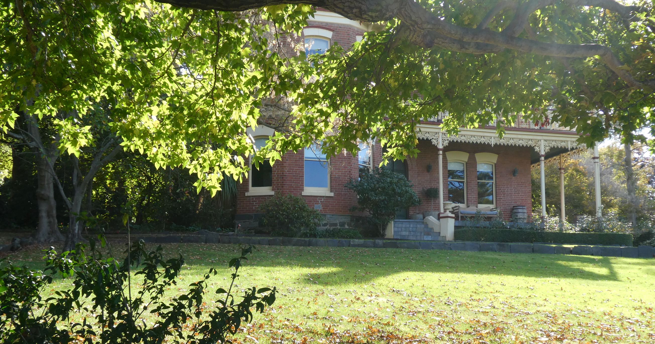
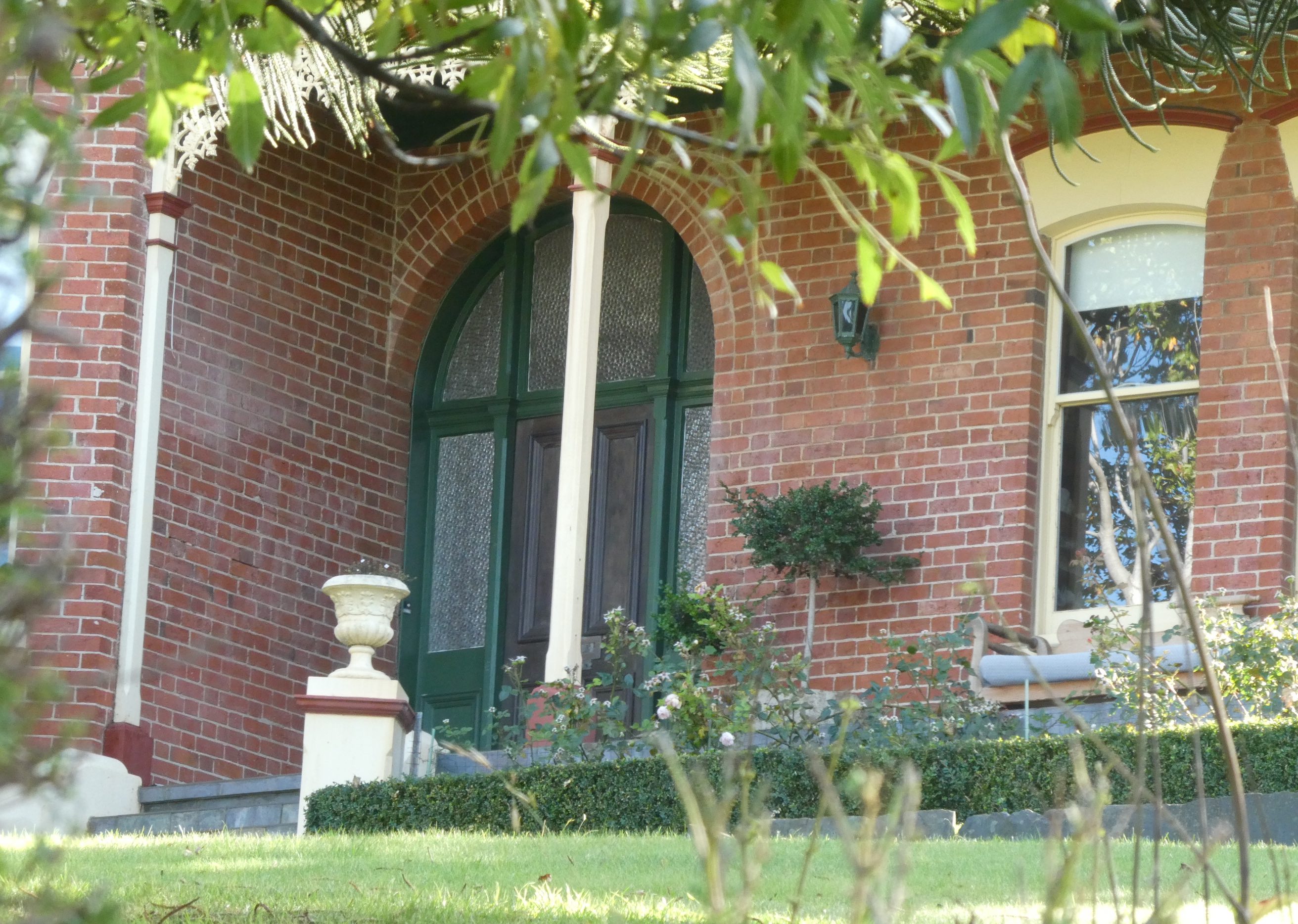
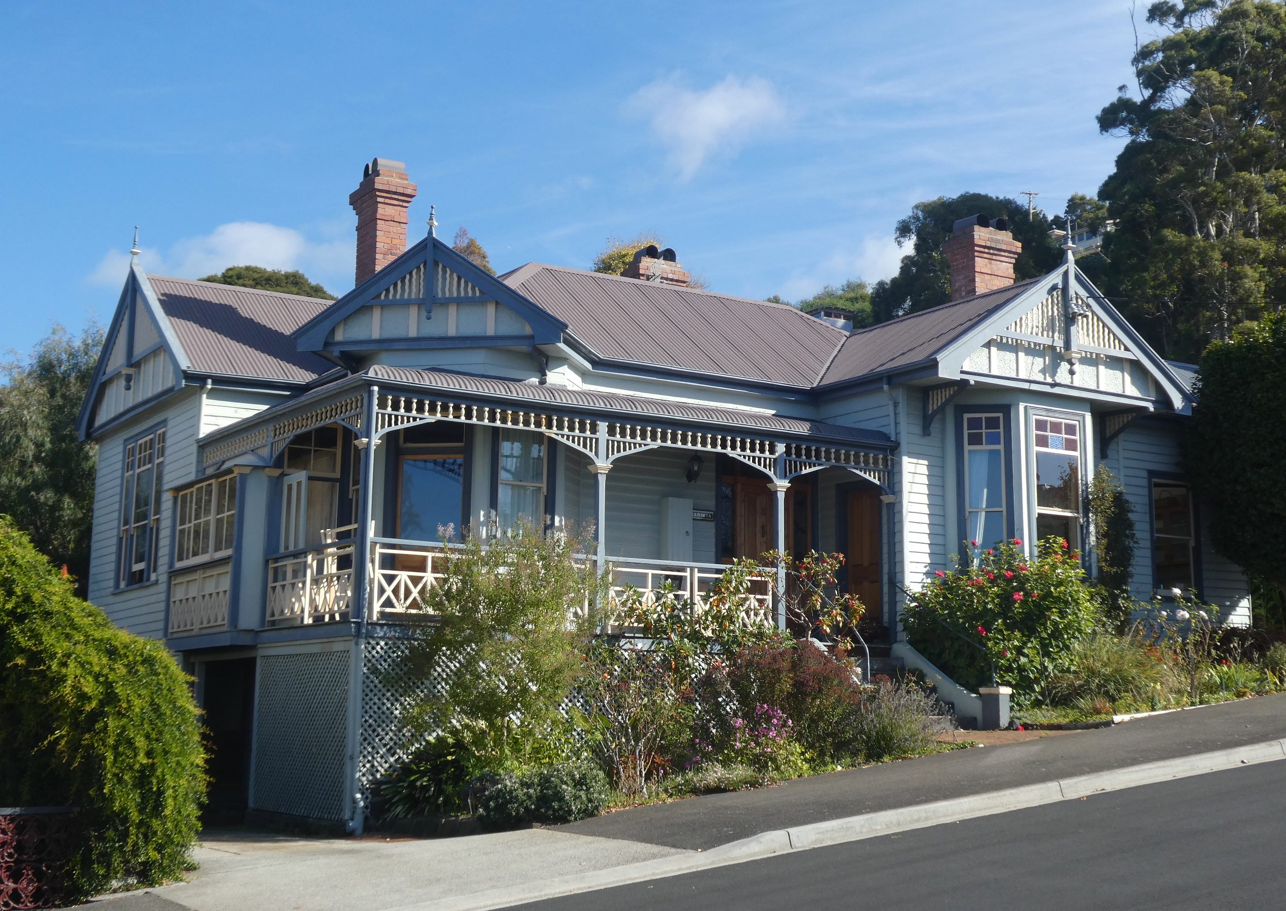
The current SES Regional Headquarters is housed in a magnificent two-storey Federation Filigree home originally built for the Lucadou-Wells family as a combined residence and dental surgery. The ornamental screening on verandahs and balconies was usually timber but in this case it is cast iron.

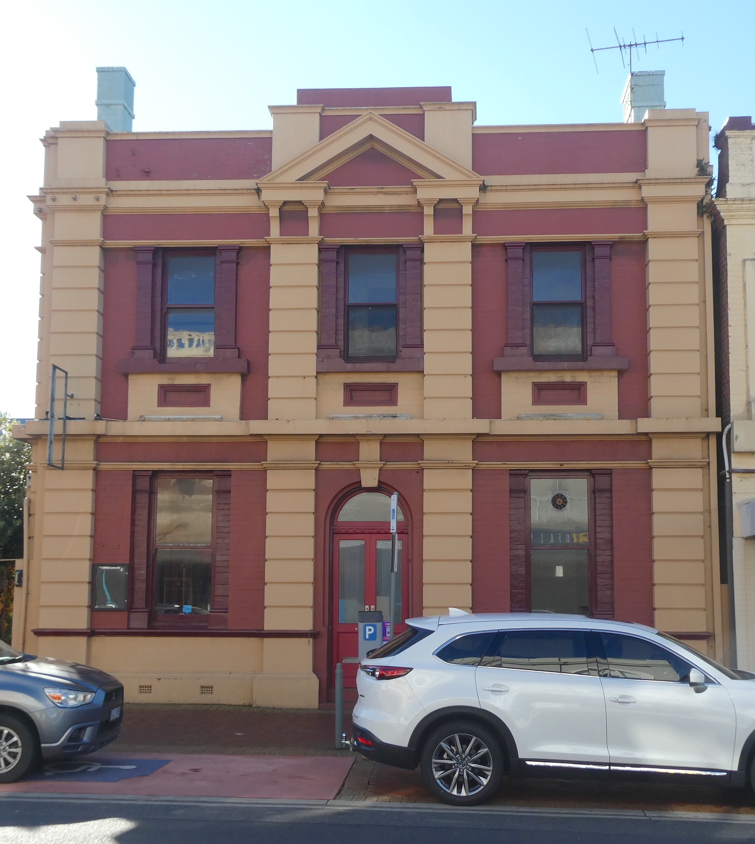
Constructed in the Federation Free Style for the Commercial Bank in 1913, I think this sandstone and brick structure is looking somewhat neglected. Known as the T.G.I.O. Building (Tasmanian Government Insurance Office) through the nineties, it is now inhabited by Steadfast Taswide Insurance Brokers.

Another beautiful building sits sadly neglected. The former Burnie branch of the Launceston Bank for Savings opened in 1928 and was most recently the premises of the Spirit Bar, a welcoming hub offering Tasmanian beer, wine, cider and spirits as well as delicious fare and live music. The forlorn façade has deteriorated dismally since the unfortunate closure of Spirit Bar a couple of years ago.

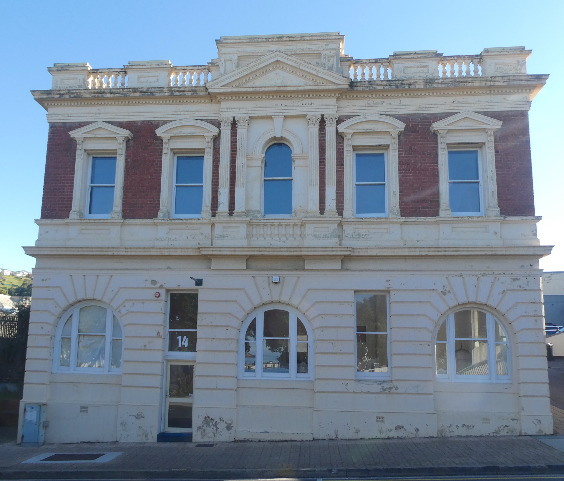
My disappointment reached a new level when I saw the condition of the Old Post Office. Purpose built in 1898, it is considered an important example of Federation Free Classical architecture. An enthusiastic couple bought the property in 2014 with plans to renovate but I can find no further reference to that story and it certainly appears deserted and decrepit.

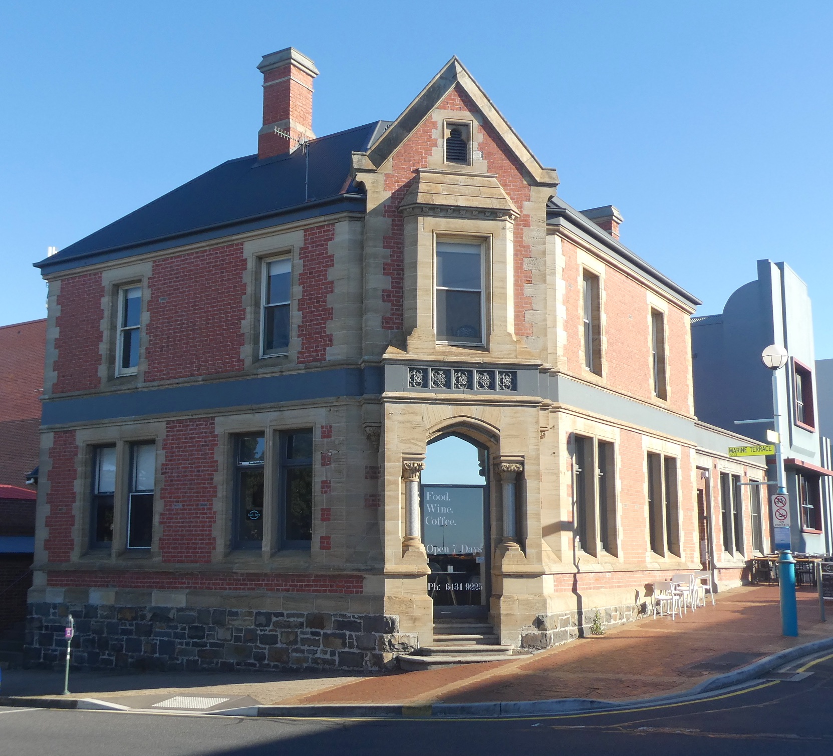
The former Bank of Van Diemen’s Land (V.D.L. Bank) building, just a few doors down from the Old Post Office, has been beautifully restored and maintained. Completed in 1892, the prominent corner position is ideal for what is now ‘Food & Brew’, a successful restaurant and wine bar serving Tasmanian produce and making the most of the stunning period architecture, both inside and out.

I fail to understand why some these buildings that are considered significant enough to be listed on the Heritage Register are not being maintained. Surely the conservation recommendation of, “this place should be retained” indicates an obligation to upkeep the premises? Perhaps some Council coffers could be allocated to restore Burnie’s historical buildings, especially those promoted in brochures to entice visitors to the town?

Federation Walk

The town of Burnie in northwest Tasmania began to boom after the discovery of tin at Waratah in 1871. Two years later, the Mount Bischoff Tin Mining Company was floated and in 1875, the VDL Company moved its headquarters from Stanley to Burnie. The tin was transported to the Burnie Port, the horse-drawn wooden rail tramway was replaced in 1884 with steam trains and steel rails. The relevance of this (yes, I’m getting there) is that it brought the wealth and impetus to build the magnificent Federation architecture that abounds in Burnie today.
Some time ago, I came across a leaflet for ‘Federation Walks of Burnie’ and only recently, on a sunny afternoon, indulged in a journey of discovery. It transpires that many of the buildings from this period are reflective of the Federation Queen Anne style, a fine example being the house known as Wyona.

Built in 1914 for Edward Alfred Joyce, a leading Tasmanian manufacturing jeweller, the house sits in a prominent position above the town on William Street on a bend where the name changes to Queen Street. Bow-windowed bays with prominent gables face both streets and a verandah projects diagonally between the two, making the most of views across the city and sea. The Tasmanian State Institute of Technology established a study centre at Wyona in 1983 and it is now the private residence of the Mayor of Burnie.

Continuing down Queen Street, Kandaha is a magnificent home built in 1888.

Set in an acre of immaculate gardens, the wide verandah is decorated with intricate cast iron brackets, fringe and railings. This was becoming rare, as cast iron was replaced in favour of machine-cut timber for balcony and verandah decoration by 1900.

Outbuildings include the original laundry with Huon pine washtubs but I’m not sure if this is it.

Queen Street was originally called Chaff Street and apparently became known as ‘Rotten Row’ due to the sub-standard housing at the time. Obviously, the area improved and in 1907 the street was renamed after Queen Alexandra of Denmark, wife of King Edward VII. In a region of rich timber resources, weatherboard became the preferred building material. Many Federation Queen Anne residences are an ‘L’ shape plan with a front room projecting forward toward the street and a verandah extending along the remainder of the frontage. Concealed within a mature garden, number 30 Queen Street was constructed in 1906 and has many of the additional characteristics of the era such as a prominent gable with half-timbered effect, valance and bargeboards with finial.

Francis Tallack is credited as being the ’architect of Burnie’ and was responsible for the construction of hotels and numerous business premises as well as private homes. Number 24 Queen Street was built by Tallack in 1910, the large front room windows face the sea and double verandah posts and curved timber have been used to create the decorative valance.

Just around the corner on Princes Street, number 1 is the house where Francis Tallack lived. The remarkable keyhole entrance is surrounded by decorative timber that continues along the verandah railing and the front door features Art Nouveau leadlight.

Princes Street is not a long street but the houses are stunning. It was originally the private driveway of a well-known homestead, Berthonville, and was renamed in 1907 after the three sons of King Edward VII and Queen Alexandra. Carinya (number 3) is beautifully maintained, decorative timber embellishments, tall chimneys and simple leadlight enhance the façade.

I would love to see inside these homes. The decorative timber continues into the hallways, mantels and wall panelling and some have the Art Nouveau touch of pressed metal ceilings. Number 5 Princes Street has an interesting turret, though I’m not sure if it is original or a later addition.

Heritage listed number 7 has all the features of the Federation Queen Anne style and is, again, superbly presented.

Across the road, another keyhole entrance leads to the verandah at number 2.

Back on Queen Street, number 22 was built in 1908 by Joseph Alexander who also built the heritage listed Ikon Hotel in Burnie. The warm red of ‘Burnie brick’ makes a change from the weatherboard façades of the era and is complemented by the paint colours on trimmings.

Nearing the end of my ‘guided’ stroll, number 20 Queen Street is a late example of the architectural style, having been constructed in 1923.

At the bottom of Queen Street, running parallel to the ocean, is Olive Street. This was the former driveway to the property known as Olive Grove, home to Joseph Law who built the Burnie Inn, the first licensed premises in Burnie that opened in 1847. Manresa, at number 7 Olive Street, was built around 1900 by Captain William Jones, a prominent local identity known as the ‘King of Burnie’. Jones was a very successful Burnie business owner and entrepreneur, owning the Burnie brickyard, hotels, butter factory, abattoir, cordial factory, timber and mining holdings and several farms. He lived in his mansion, Menai, in South Burnie and built Manresa for one of his sons.

As I delve further into the history of Burnie, I am boggled by the enterprising people who had vision for this town nearly two hundred years ago. Hopefully, the heritage of this region won’t be lost and will come to be appreciated by future generations.

Star of the Sea

For many years, I have been fascinated by a beautiful red brick church perched on a hill at one of the main intersections on the highway here in Burnie. Beside it are other similarly constructed edifices, one of which appears to be a school with the year 1912 above the doorway. To satisfy my curiosity, I recently took a closer look. The Catholic Church of St. Mary’s Star of the Sea opened in January 1891.

Designed by respected architect Alexander North, whose work includes Holy Trinity in Launceston, the church is an excellent example of the High Victorian Gothic style. There is no door at the front of the church, the entrance is via a porch on the eastern side wall above which is an elaborately carved white cross imported from New Zealand.

The red bricks were manufactured locally in Burnie while specially moulded bricks and terracotta tiles with a stylised flower design came from Launceston. The finest quality sandstone from Ross quarry in Tasmania’s midlands was used for the window frames.

The use of black bricks amongst the red ones to create geometric patterns, known as structural polychromy, was one of the features of High Victorian Gothic buildings.

The Welsh slates on the pitched roof have stood the test of time.

The interior is welcoming and warm with red brick walls and a pine lined roof.

I made my way to the chancel

where a trinity of colourful stained glass windows depict the Annunciation, the Sacred Heart appearing to St. Margaret Mary Alacoque and the Nativity.

All the windows are of stained glass, the bold geometric patterns throughout the nave were designed by North himself.

A small side chapel in the east transept beatifically captured the morning sun

while the votive candles in the west transept awaited the congregation for Holy Thursday.

The ceiling is a work of art, the spiky elaborate roof trusses are another example of High Victorian Gothic style.

The porch is adorned with memorials of many people associated with the church. St. Mary’s by the Sea was originally a small wooden church on the corner of Cattley Street and Marine Terrace in town. When Irishman Father Matthew O’Callaghan became parish priest, he was instrumental in selling that property and purchasing the land on which the new church was built. He was transferred to Queenstown in 1897 and died two years later. His remains were returned to Burnie for burial in the parish he had served for twenty five years.

The memorials to the Dunphy and Cooney families have piqued my interest. I have found they are buried in the Wivenhoe cemetery a short drive from our house, I shall investigate further.

Another Irishman, Father Patrick Hayes, was appointed to the parish in 1889 and was responsible for building a Catholic school in 1912 and adding a presbytery in 1928. He retired in 1947 and, passing away in 1954, was also buried at Wivenhoe.

A historic plaque was discovered by current parish priest, Father John Girdauskas, beneath the Star of the Sea church, commemorating the opening of St. Anne’s Catholic church and primary school in 1961.

The gardens on the two acre site have been established and are tended by volunteers.

A tidy section by the steps from the car park is dedicated to Father Terry McCosker, whose arrival in 1988 was sadly cut short due to illness.

The steeply sloping land behind the church has been landscaped with care and many hours of hard work have resulted in some very impressive retaining walls.

The path continues from the more formal gardens to a natural reserve, dedicated to the Fraser family.

St. Mary’s Star of the Sea has escaped the threat of removal twice. Firstly with the relocation of the Burnie Highway in 1979 and again just before Fr Girdauskas took over when the Marist priests intended building a replacement church near Marist College. The church is now heritage listed, as it should be.

paper on skin – the film

Last Friday evening, we attended the premiere screening of Design Eye Creative paper on skin 2020 – The Film. It was wonderful to watch these fabulous garments brought to life on the big screen and to have been a part of the journey. The film can be viewed as a whole or in sections and another presents a forum with the judges explaining their rationale. They can be viewed on the Burnie Arts Council website here, sit back and enjoy.

Winner of the $5,000 Design Eye Creative Major Award, Waratah by Amanda May (VIC)

paper on skin

The inaugural paper on skin competition transpired in 2012, the brainchild of Burnie denizen, paper artist Pam Thorne. The concept of wearable art links a strong history of paper making in Burnie with the creative talents of local and international artists. When we learned the major sponsor had withdrawn, we didn’t hesitate to offer our support and so, Design Eye Creative paper on skin 2020 became the new incarnation. Usually, the competition culminates with a gala parade and award evening, however, with the advent of social distancing regulations, a new strategy emerged. The award ceremony was live-streamed through Facebook followed by an exhibition of the garments at Burnie Regional Art Gallery for four weeks. In lieu of the catwalk parade, a series of films have been produced to allow a greater audience appreciation. We were privileged to witness some of the filming at the Burnie Arts & Function Centre. Tasmanian artist, Marion Kennedy, was on hand for last minute adjustments to her entry, Fathoms

and the seemingly simplistic Flow will be explained later.

The movies will be released on 4th September and I will publish the links when available. Meanwhile, join me at the exhibition. The competition is not themed and each entry, which must be made from at least 80% paper, has its own story. Guardian of the Southern Convergence, made with hand dyed indigo kozo paper by Liz Powell & Dr Denise N Rall (NSW) is based on the Antarctic Convergence, the threat from environmental change and the alliance of countries protecting it from exploitation.

Over 2,300 folded paper and silk paper spheres have been mathematically engineered and sewn together to create Flower of Life. Brielle Killip worked with Chris Geissinger & Jennifer Garber (Denver Colorado, USA) to produce a garment that is both a bold statement and is comfortable to wear, earning them the $2,000 Runner-Up Award as well as the $500 Public Vote Award.

When Queenslander, Karen Benjamin, conceived her idea for Flow, she had no idea how pertinent her entry would be. Made from toilet paper, each circle has been coloured with permanent marker and hand stitched, creating the illusion of flowing water. The degree of difficulty was enhanced when pandemic panic buying brought a halt to production but, on the up side, the idea for the face mask accessory was born.

Burgeon is an interesting collaboration between Portuguese paper artist and jeweller Renata Fukuda & fashion designer Marta Lisboa, playing with proportion in unpredictable ways.

Lorreny Vera from Victoria has tapped into her Venezuelan roots to create Queen Guacamaya, the queen of the jungle.

Toyo paper braid is the basis for Calligraphica by RR Pascoe (NSW) who has been creating artworks from reclaimed and sustainable materials for more than two decades.

Jade Kahle (VIC) has mastered the art of knitting and crocheting with paper string, enjoying the texture, stitch definition and sculptural effects to culminate in her entry The Esther Dress.

Paper card was the material of choice for Janine Hilder (VIC) for her pastel creation, Lantern Lass.

Although we had a preview of Fathoms at the filming session, I hadn’t realised the detail of the underwater world featured on the gown.

It may not have won any awards but Connie’s Coat stole my heart. A wonderful collaboration between Anne Gason, Barb Adams, Chris Rose, Chris Smith & Gail Stiffe (VIC), the handmade paper gives the illusion of a well-worn coat with a treasure in every pocket. There is a story behind this garment; “The Coat of Connie McBride: Connie sailed from Dublin to Melbourne in 1885 with her brother Darcy. After a few years trapped in the city slums they travelled to Jamieson VIC to prospect for gold. Darcy moved to Beechworth, but Connie befriended the publican of the ‘Diggers Exchange Hotel’ where she worked until it closed in 1911 due to the actions of the ‘Liquor Licence Reduction Board’. Connie lived until she was 95 (died 1970).”

46.Connie's Coat

Plotting paper has been used by Laila-Inga Mueterthies (Germany) for her piece, Papyria.

Stunning by design, the kozo and recycled paper entry Snowy Mountains Dreaming by Polly Crowden (NSW) pushed the boundaries of ‘wearable’.

Technology, art and fashion synthesise in Rockabetty by Tara Morelos & Liz Bradshaw (NSW).

If you have ever enjoyed a cup of tea you will appreciate the ingenious re-use of tea bags in New Life. Denise Lamby (QLD) spent hours drying soggy tea bags to reincarnate them in a fabulous, colourful art form.

The throwaway culture of the fashion industry is highlighted in the entry from Kate Dunn (NSW), Exposure.

The enigmatic Foggy Lady by Mali Klein (Netherlands) comprises an ensemble of handmade paper dyed with natural pigments.

Local Burnie artist, Joan Stammers, has created a spectacularly grand costume using recycled papers. The floral trimmings on Let them eat cake would be worthy of any garden competition.

With her 100% paper entry, Loong (Dragon) Tale, Simone Guascoine (NSW) has used sewing techniques taught by her grandmother to create her Japanese themed outfit.

The winner of the $5,000 Major Award, Amanda May (VIC), designed a beautiful, bright representation of the Australian native flower, Waratah. The vital work of our Australian native bees hasn’t been forgotten with the eco-addition of a Blue Banded Bee.

The pretty Pretend Print-cess by Kelcie Bryant (NSW) is reminiscent of a feminine sundress accompanied by a playful rabbit mask.

Handmade paper has been used by Amee Dennis (NSW) for her creation, Study of Grass.

The TasmAsian by Cynthia Hawkins is an intriguing fusion of her Malaysian roots and adopted home of Tasmania.

A second entry by Laila-Inga Mueterthies (Germany), Showtime, is truly stunning. With the use of plotter paper, we are taken back to a time when style meant elegance and sophistication.

Another local entrant, Chloe Townsend, has successfully transformed her concept to reality with the aptly named Flame.

With so many fabulous entries, choosing one for my public vote wasn’t easy but Musings On Things Ethereal by Kathryn Wilkinson (NSW) was outstanding. Mulberry paper, teabags and silk organza combine perfectly in this stunning creation, I would love to add this to my wardrobe.

Donna Vo (NSW) has used artisanal Japanese washi paper along with paper raffia for her composition, The Shedding. Her piece, “represents the shedding of ideals placed on a female as a child, a young adult and as a mother.”

Inspired by the natural world, Svenja (QLD) has shared her fascination in her design, Cosmic leafy sea dragon.

Unfortunately, two artists missed the judging due to upheavals in the postal system. Romanian Antoaneta Tica was selected as a finalist but her work was stranded when international freight and postage lines closed. However, she organised a photo shoot and it can be viewed on the paper on skin Facebook page. Tony Williams (Cleveland Ohio USA) also encountered problems with freight and his three entries arrived after the judging and filming but in time for the final week of the exhibition. Tony’s spectacular creations can also be seen on Facebook.

131.Film